An alternative title to this post could be "Another Reason We Own Scaffolding..."
The first thing we did when we moved into the house was tear out the grass green carpet in the great room to expose the hardwood floors. (Check out the house tour--before on the right to check out that beautiful green carpet.) I was very anxious to see what was under those carpets after 45 years! (It was good....but that's a story for another day).
After doing that, the walls that formerly appeared to be "white" appeared to be dingy yellow...and so did the trim, etc. I thought I wanted more of an art gallery feel in the great room and since it gets so much natural light, I thought pure white was the way to go in this room. Not a warm white, but a pure, pristine, cool white--I picked Benjamin Moore Decorators White for the trim and the walls. Hubby and I painted all of the trim around the windows, the bookcase, the baseboards, and the moldings Decorators White and then we tackled the walls. I was very much inspired by Laurie Hickson Smith (remember Trading Spaces?!) and the remodel of her Mid-Century home in her book, Discovering Home with Laurie Smith. In her book, she struggled with remodeling her home in a way that stayed true to its mid-century roots but still infused her southern style. She picked a very pure white for the walls and moldings and then infused color through fabrics and art. I think she did a beautiful job and highly recommend the book to anyone interested in design and merging different aesthetics. In hindsight, had I had the funds to have amazing art and recover all of our upholstery in amazing fabrics, the white walls would have looked great. But I didn't and the walls didn't. It took forever but here is what our great room looked like after we finished all this painting with the Decorators White.
 |
| Our so-so sea of beige. |
Sorry it's not the greatest picture--I have a lot to learn about photography. But essentially it shows the gist of the problem. After living with it for two years, I basically felt that it sucked the life out of me--it was a sea of beige! It wasn't "terrible" but it could be so much better. So I hired an interior designer (Jason Longo, JDL Interiors) that I had met a year or so before to color consult with me. Jason was one of the few designers I've found in Rochester that have a more modern aesthetic. Rochester is a very traditional town and most folks have traditional sensibilities. There isn't a lot of modern architecture or stores that feature modern design--although I think the area is ripe for it. Western New York desperately needs an Ikea, a Crate and Barrel, a West Elm, a Room and Board, etc. We do however have a handful of fantastic, locally owned stores such as Room in Buffalo and Viking International for more modern Scandinavian designs. We also have Metro Retro on Park Avenue for some great MCM finds. But I digress...
Finding a color for this room was WAY harder than you can imagine and considering the size of the room, I didn't want to screw it up again! It was well-worth paying Jason for a few hours to consult with me. The thing about it that is so hard is you have to find a color that doesn't blend with the fireplace, and complements the yellow tones in the floor and the orange tones in the ceiling. We went through a whole bunch of colors and we found a few that we thought may look good. Our final candidates were Benjamin Moore Moonshine, Cashmere Gray, Gray Horse, or Misted Green.
Jason ordered large samples for us and we hung them all over the room and stared at them for a few months--yes, months--because we couldn't make up our mind. Visitors who entered our home had to vote as well. After much deliberation, we picked Cashmere Gray. I really liked Moonshine but my hubby reallly liked Cashmere Gray so I just let him win--for once:-) I did the low parts, and hubby did the high parts, and we knocked this baby out in one weekend. It helped (A LOT) that we didn't have to paint the trim-again. Here are some in-process pics:
 |
| How we reach the highest points in the room. |
 |
| One side of the room is done and it is getting dark. |
 |
| You can really see the difference between the BM Cashmere Gray (left) and the Decorators White (right) |
 |
| Looking towards the other side of the room. |
 |
| Painting into the night. |
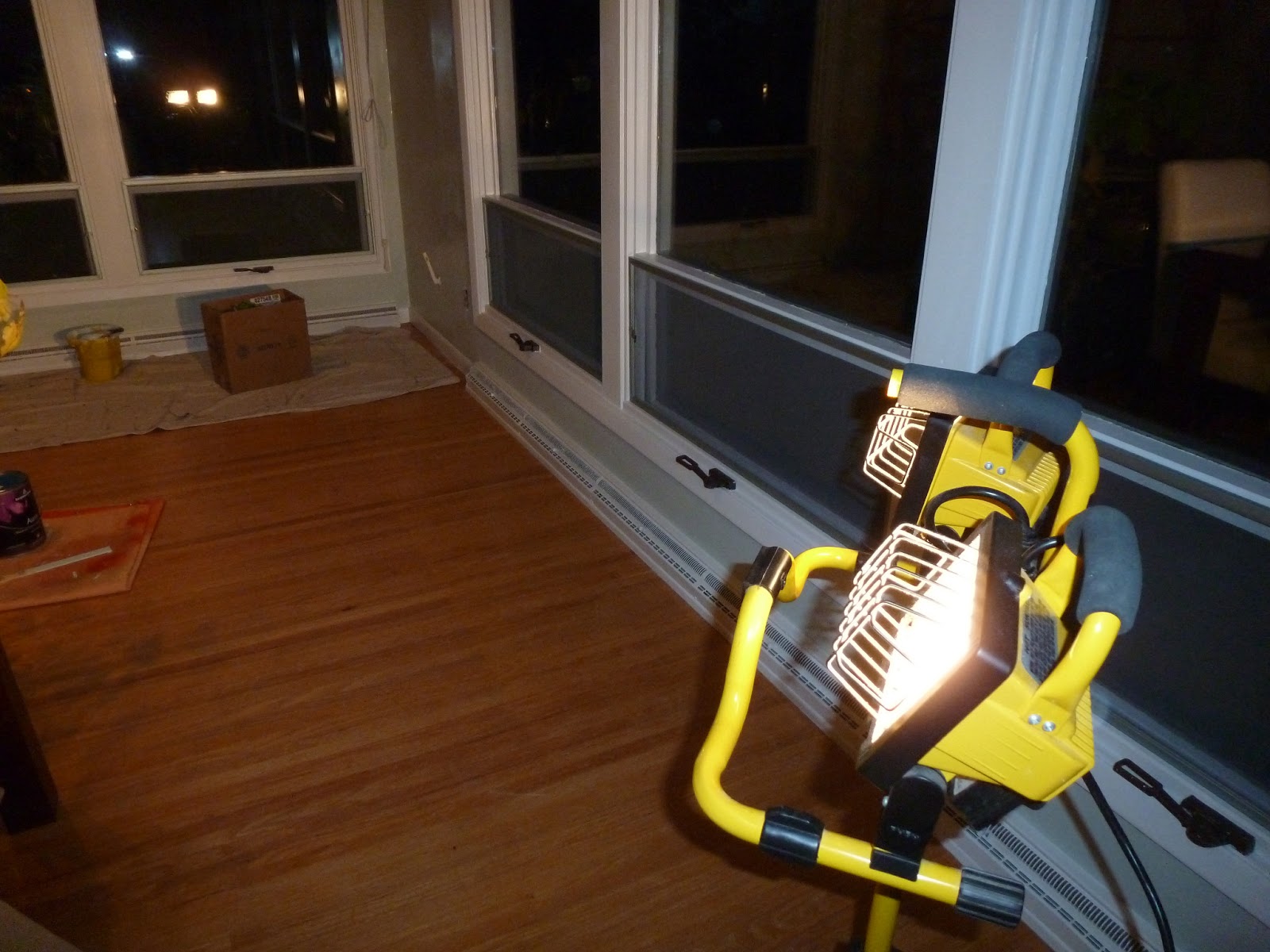 |
| How we paint into the night. Brings back memories of my parents working on our house by the light of car headlights. Must be where I get it from. |
 |
| Finished!! The Art will be the subject of another Post. |
 |
| Finished! |
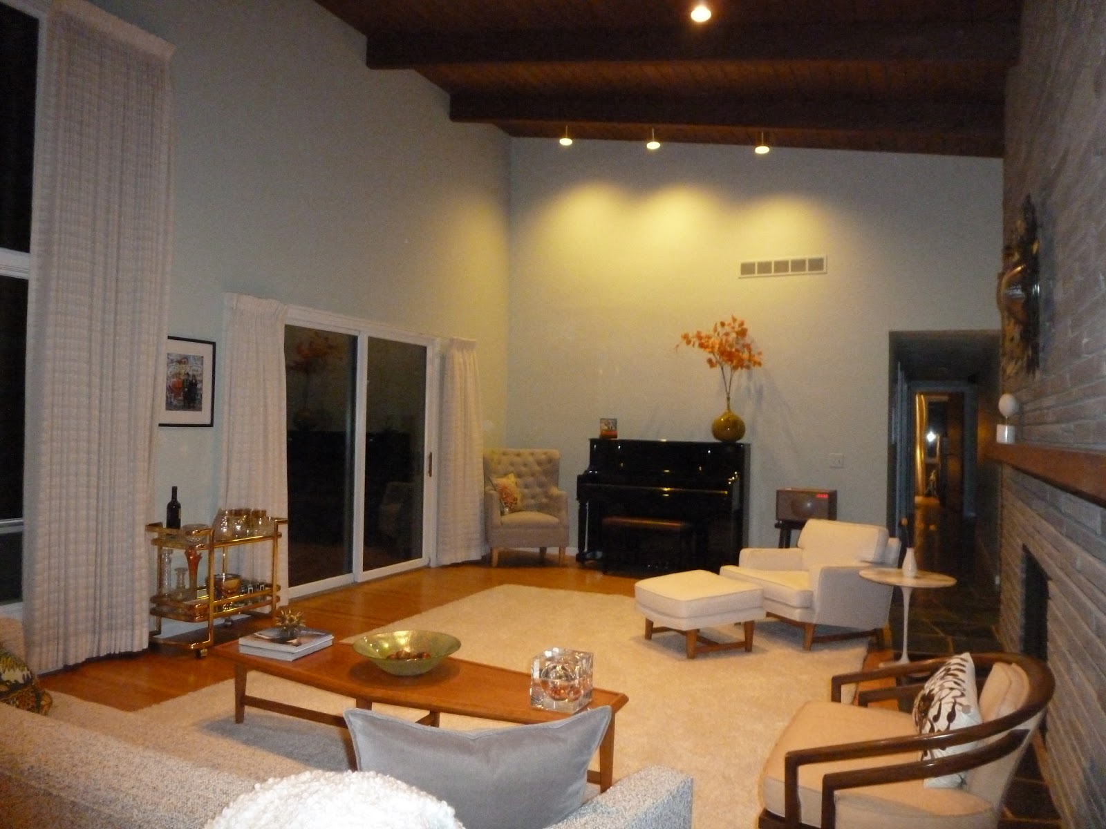 |
| Night view of color |
 |
| Night view of color. |
Comments
Post a Comment